Colour Mapping for Interiors: Swatches and Spatial Washes Compared
Colour Mapping for Interiors: Swatches and Spatial Washes Compared
Recording colour within an interior can be approached in at least two distinct ways. One is the swatch: small, separate patches of pigment that stand in for materials. The other is the spatial wash: applying colour across a drawn or painted view to capture how light and surface interact. Both are legitimate studio methods and they answer different questions about a space.
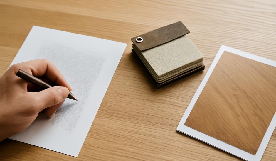
Swatches: Material Samples
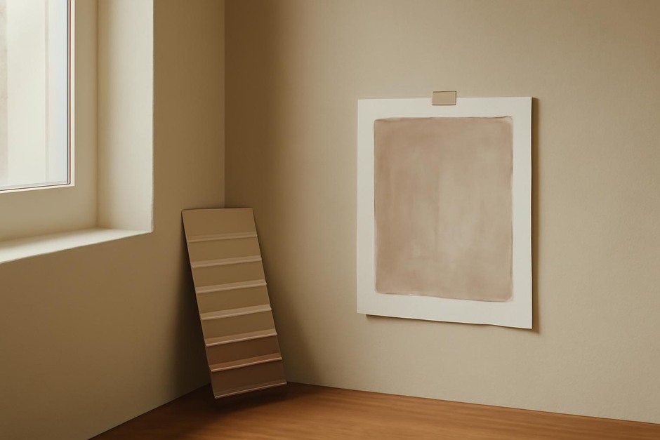
A swatch is a discrete, usually neutral-ground patch of colour labeled and sometimes annotated with material notes—matte plaster, glossy ceramic, warm oak, or cool metal. Swatches are handy when your interest is in matching, cataloguing, or comparing materials. They work well in a swatchbook or curated sketchbook section where you collect repeated samples from different rooms.
Swatching clarifies base hue, saturation, and relative value without committing to the complications of local light or reflections. A swatch of a painted wall is a direct note about pigment and finish. The limitation is that swatches can deceive if you neglect context: the same paint can read very differently under warm afternoon light or behind a translucent lampshade.
Spatial Washes: Colour in Context
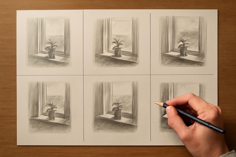
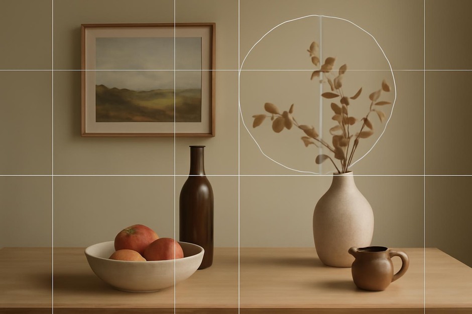
Spatial washes place colour across a composition. Instead of isolated patches, washes situate pigments within planes and volumes, recording how light softens edges, how reflected colour mingles between surfaces, and how atmosphere affects chroma. A wash will often reveal relationships—how a carpet borrows warmth from a sunlit wall, or how a chrome handle casts a cool hint onto neighboring paint.
Washes are especially useful when you care about mood, perceived temperature, and the visual interaction between elements. They require more decisiveness and a willingness to accept approximation: capturing how much desaturation an object undergoes in shadow is often more informative than a precise swatch value might suggest.
Comparative Uses
- Swatches are useful for procurement, material memory, and systematic comparison across sites.
- Washes are useful for understanding atmospheric colour, light interactions, and compositional effects.
Practical Pairing
In many projects a short session of both techniques is productive. On one page paint three to five swatches for key materials and annotate them. On the facing page create a small wash study of the same view to see how the swatches behave in context. Noting both the isolated and the contextualised colour gives a fuller record for later decisions.
When working with paints try to limit your palette in a wash study to three primary modifiers: a warm, a cool, and a neutral. This restriction helps you notice how subtle temperature shifts alter perception without overcomplicating the initial read. For swatches, include notes about finish and reflectivity—matte plaster behaves differently from eggshell paint even if the hue looks similar.
Exercises
- Choose a corner of a room. Make three labeled swatches for the wall, floor, and a dominant object. Then make a 15-minute wash study of the same corner and compare how the swatches shift in the painted scene.
- Create a two-step record: a swatch strip for material procurement and a wash thumbnail for lighting decisions. Keep both in the same sketchbook spread.
Swatches and washes answer different design questions. Swatches speak to materials; washes speak to atmosphere. Together they form a practice that treats colour as both a material decision and a dynamic consequence of space and light.